Thursday, 20 December 2012

Music magazine questionnaire analysis

Music magazine questionnaire analysis

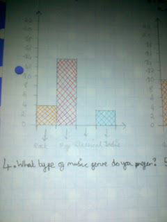
These are the graphs I have drawn. The information is from my music magazine questionnaire. I have drawn graphs for questions 1,2,3,4 and 5. I have included close ups of each graph to make the information clear and easy to read. I coloured each answer in a different colour so it was clear to see the results. 


Thursday, 13 December 2012

Music magazine questionnaire written analysis

Music magazine questionnaire written analysis

I asked 21 people to answer my questionnaire.


Music Magazine Questionnaire
Please tick the answer that is relevant to you

1. How old are you?

- 10 - 13 : 0 people ticked this answer. 
     
- 14 - 17 : 15 people ticked this answer.
     
- 18 - 21 : 3 people ticked this answer.

- 21+ : 3 people ticked this answer.

2. How much are you willing to pay for a magazine?

- 50p - £1.00 : 0 people ticked this answer.

- £1.50 - £2.00 : 2 people ticked this answer.

- £2.50 - £3.00 : 12 people ticked this answer. 

- £3.00+ : 7 people ticked this answer.

3. What gender are you?

- Female : 21 people ticked this answer.

- Male : 0 people ticked this answer.

4. What type of music genre do you prefer? 

- Rock : 4 people ticked this answer. 

- Pop : 14 people ticked this answer.

- Classical : 0 people ticked this answer.

- Indie : 3 people ticked this answer.

5. What type of music artists do you prefer?

- Bands : 10 people ticked this answer.

- Duo's : 0 people ticked this answer. 

- Single artists : 11 people ticked this answer.

- Choirs : 0 people ticked this answer.

6. What would you like to be included in a Pop magazine?

- Fashion: New trends, New hairstyles, New make up, etc. : 6 people ticked this answer.

- Celebrity gossip: What are celebrities doing?, What do they look like now?, Have they embarrassed themselves?, etc. : 12 people ticked this answer. 

- Personal advice: How to cope with life, How to beat bullies, How to get help, etc. : 0 people ticked this answer.

- How to get a certain look: Look like a certain Pop celebrity, etc. : 3 people ticked this answer.

7. What would you expect to be on a front cover of a Pop magazine?

- A new artist/band : 15 people ticked this answer.

- New make up/hairstyles : 0 people ticked this answer.  

- Fashion trends/new styles/how to dress like a certain celebrity : 5 people ticked this answer.

- Advertisements for competition: Win a date with JLS : 1 person ticked this answer.

8. What would you like to be included in the articles?

- Stories about celebrities : 12 people ticked this answer.

- Instructions on how to style your hair/style your make up, etc. : 7 people ticked this answer. 

- Stories about real life people: How people cope with their problems/how they cope with their lives, etc. : 0 people ticked this answer.

- Quizzes/puzzles to do with celebrities : 2 people ticked this answer. 

9. What name do you prefer?

- Amplified : 12 people ticked this answer.

- Loud : 6 people ticked this answer. 

- Don't stop the music : 1 person ticked this answer. 

- Noise : 2 people ticked this answer.

10. How often do you read magazines?

- Daily : 0 people ticked this answer.

- Weekly : 3 people ticked this answer.

- Monthly : 7 people ticked this answer. 

- Hardly ever : 11 people ticked this answer.

From the results of my questionnaire I have concluded that my target market is teenagers between the age of 14 - 17. The amount people are willing to pay is £2.50 - £3.00. I only asked females as my magazine is aimed at young females. The main genre that was chosen was Pop. People seem to like single artists mainly and they want celebrity gossip included in a Pop magazine. The highest answer for what people expected to be on the front cover of a Pop magazine was a new artist/band. In the articles, stories about celebrities would be included and the name that was the most popular was Amplified. People said that they read magazines hardly ever.      

Friday, 7 December 2012

Reader profile

Reader profile:

Who my reader will be and why?

For my magazine my reader will be between the ages of 14 and 17. I have chosen this age range as my target audience because it is the typical age range that are known as teenagers and these are the type of people who read gossip magazines. Also this was the top age range in my questionnaire. The readers will also be female. I have chosen young females because my magazine will include things like makeup tutorials, how to style your hair and advertisements for clothes, shoes accessories etc. Also I will include pictures of male music artists and this attracts young females. Another reason why I chose my readers to be female is because my magazines will be specifically aimed at females and I only asked females in my questionnaire. 

What their interests will be?

- Makeup
- Hair 
- Clothes
- Shoes
- Accessories: belts, bags, jewellery, hats, scarves etc. 
- Gossip
- Celebrities: Females because young females can look up to them and see them as idols and males because young females would admire them and fancy them.
- Music
- Music artists: single artists and bands mainly because these were the answers chosen in my questionnaire.
- Fashion

More about why I have chosen this type of reader:

My magazine will be a girly music magazine. It will include girly things and things to do with music and music artists. I will also include puzzles/quizzes to do with music artists for example a title could be, 'Are you a true JLS fan?' and following this could be questions to do with this. As I am a girl myself I think it will be easy to understand what young teenage girls like.

Research about my chosen reader:

An article to do with marketing for young females:

MARKETING TO A TEENAGE GIRL, WHAT TO CONSIDER

It seems like it should be pretty easy to market to teenage girls. Their likes, dislikes, trends, and interests are already marketed like crazy, so one would think it'd be easy to just slip in and find a niche in the teen market. Not so. Instead, marketing to a teenage girl needs to be done in certain ways and it's important to know what to consider.

Teenagers, both boys and girls, are very aware that they are being marketed to constantly. They just need to turn on the television, open a magazine, or even go to school. Schools themselves are open to companies marketing to kids at school - how many soda machines are in the cafeterias and common rooms in a typical junior high and high school? Just that one example can give an idea of how bombarded teens are by companies' marketing tactics. 

Since teen girls are very aware of the competition for their attention and money, they can be a little skeptical and harder to impress. While their skepticism may be a hurdle, it is good to know about it before coming up with a marketing plan. Recognize that teens want something that feels real and believable - if you do, chances are they will be more open to what you have to offer.
Girls obviously have different needs and interests than boys. While this seems obvious, some companies market to just a general teen audience. In many cases this can seem impersonal and some teens may perceive it as disconnected and preachy. Advertisers walk a fine line when marketing to both teenage boys and girls.
Companies must be especially careful when marketing to girls - the fine line they walk is even finer when it comes to girls. This is because many people attribute the pressure to be thin, to be beautiful, to be like movie stars and models to the way companies market to teen girls. Many also attribute girls' low self- esteem to insensitive, unrealistic marketing. To take it even further, many have blamed some marketing tactics as causing eating disorders in teenage girls, due to messages sent by companies through their advertising.

Just about every teenage girl, no matter what size or shape or ethnicity, feels vulnerable and sensitive when it comes to appearance. Companies should be careful and avoid playing upon this vulnerability to get girls to spend money on cosmetics and other products related to appearance. Companies who use unreal expectations and models to market to teens risk having both the teens and their parents respond negatively to their campaigns. Plus, it is clearly irresponsible for a company to prey upon teenage girls' insecurity - any company that does so deserves all of the backlash they will most likely get.

Marketing to teens by using unrealistic models and setting unattainable expectations doesn't always work as well as other methods - in fact, there are other options that are proving to be more effective. Since the 1990's, the notion of "girl power" has really struck a chord with teenage girls. Girls like feeling strong and in control - in a teenage world of rules, deadlines, and curfews, teens find a sense of girl power as a fun change of pace.

Often, teenage girls are marketed to with movie or music stars that are much older than they are and often portrayed in ways that are sometimes overtly sexual or just more adult. While using prominent stars is appealing, it doesn't always ring true. It is okay to include some older stars (teens like to feel more adult), but also include some things that still have a teenage feel to them. Find a balance.

An example of girl power and marketing to teens with someone that is their age can be seen with the Hannah Montana craze that is taking America by storm. Hannah Montana/Miley Cyrus resonates with teen girls because she's cool, she wears clothes they could wear, and teenage can relate to the lyrics of her music. She exudes confidence and girls respect and want to emulate that. One could assume that the huge popularity of Hannah Montana is because this niche, of a normal yet also glamorous teenage girl, hadn't been addressed before.

With a little creativity and sensitivity to teenage girls, companies can market effectively to this demographic. If a company can market to this group effectively, chances are that the teenage girl will stay loyal to the brand and invest their hard earned money in their products for many years.

Tuesday, 4 December 2012

Music magazine questionnaire

Music Magazine Questionnaire
Please tick the answer that is relevant to you

1. How old are you?

- 10 - 13
     
- 14 - 17
     
- 18 - 21

- 21+

2. How much are you willing to pay for a magazine?

- 50p - £1.00

- £1.50 - £2.00

- £2.50 - £3.00

- £3.00+

3. What gender are you?

- Female

- Male

4. What type of music genre do you prefer? 

- Rock

- Pop

- Classical

- Indie

5. What type of music artists do you prefer?

- Bands

- Duo's

- Single artists

- Choirs 

6. What would you like to be included in a Pop magazine?

- Fashion: New trends, New hairstyles, New make up, etc.

- Celebrity gossip: What are celebrities doing?, What do they look like now?, Have they embarrassed themselves?, etc.

- Personal advice: How to cope with life, How to beat bullies, How to get help, etc.

- How to get a certain look: Look like a certain Pop celebrity, etc.

7. What would you expect to be on a front cover of a Pop magazine?

- A new artist/band

- New make up/hairstyles 

- Fashion trends/new styles/how to dress like a certain celebrity

- Advertisements for competition: Win a date with JLS

8. What would you like to be included in the articles?

- Stories about celebrities

- Instructions on how to style your hair/style your make up, etc. 

- Stories about real life people: How people cope with their problems/how they cope with their lives, etc.

- Quizzes/puzzles to do with celebrities 

9. What name do you prefer?

- Amplified

- Loud 

- Don't stop the music

- Noise

10. How often do you read magazines?

- Daily

- Weekly

- Monthly 

- Hardly ever

Friday, 30 November 2012

Music magazine contents page analysis

Music magazine contents page analysis


The annotations are:

- All of the colours go together well and don't clash. The colours are feminine colours which implies that the magazine is for females. Only five colours are used on this contents page, yellow, white, black, light pink and dark pink, plus the colours included in the picture.
- A website adress has been added to get people to visit it. The website is for extra information about the magazine.
- A big picture is in the centre to get peoples attention and to get them to read it. It is also a celebrity which would get peoples attention straight away. If people are fans of the celebrity they would want to read the article and because the celebrity is a really famous celebrity as he is a actor from Twilight, fans of Twilight would also want to read it.
- A catchy title and slogan is used to get peoples attention and to get them too read it, plus it is about the celebrity so they would want to go to the page that it is on and read all about it. 'Tender or Tough?' is a rhetorical question which needs no answer but readers would want to find out the answer so they would read the article.
- There is a brief introduction about what the article is about and has the celebrities name in bold to tell people who the article is about and to get them to read it if they like him.
- A few pictures are included of the celebrity which shows the article is about him.
- Another web adress is included on this page.
- There is a picture of a male's naked torso and this would get readers to look at page nine because you would be intrigued and would want to see it as you would be attracted to it. Mainly females only though. Females are usually attracted to naked mens torso's as they think of them as the ideal type if the torso has a six pack etc. 
- The background is pink. Pink represents females as it is a feminine colour, hence why this is a girly magazine.
- There is a picture of a famous actor who is also a teen sweetheart who people love and adore. They have specifically used these teen sweetheart so it attracts young teenage females who love him and who are fans of the film he is in.
- 'Gossip2Go' - the main heading for all top of the pops magazines (for the contents page). It is bold and bright and tells you exactly what you are going to get in the magazine, 'Gossip'. The 'Go' and '2' is in pink whereas the other letters are in black. I think this is because the contents page usually tells you where to go in the magazines and if you read the words together it says 'Go 2'.
- All writing is clear and easy to read. There are a few fonts used here. I think that there are only a few fonts used because it keeps it simple but effective. If too many fonts were used then it would look too busy.  

Monday, 26 November 2012

Music magazine double page spread analysis


Music magazine double page spread analysis


The annotations are:

This double page spread is about the latest summer clothing, what works well together and how to get 'the celebrity look' and where to get the clothes from.

- The title 'WALKING ON SUNSHINE' attracts attention to the reader as it is an unique title and it makes the reader become interested. The title instantly informs us that the clothes are summer clothes and the letters are in summery colours such as orange and pink. The letters are also in capslock and the SUNSHINE is in bold to show the reader that the double page spread is to do with summer clothing.
- In the corner of the page is says 'EVERYTHING UNDER £15' and underneathe that is says 'ESSENTIAL BUYS'. Everything under £15 is in capslock because it draws the readers attention to the price, the fact that £15 is in bold draws even more attention to the price because your eyes instantly go to the bold writing. Essential buys is in a pink banner which also draws attention as pink is a bright, bold colour and becasue the writing is white it makes it stand out. Essential means absolutely necessary and extremely important. The use of essential makes the reader think that they must have that piece of clothing.
- The part underneath the title 'Take a summer stroll in these cool combos with mix 'n' match sunnies and sandals...' adresses the reader directly as it is giving the readers a command kind of or a suggestion.
- There are pictures of outfits to show what goes well together and they have also matched celebrities with the outfits to show the reader how they can get that celebrities look. Next to one outfit is a picture of Miley Cyrus and there is also a caption saying 'MILEY does comfy chic in cute cream shorts. They have done this with other celebrities too. Above the outfits are the places where you can purchase them for example Primark, New Look and Next. The prices are also shown next to the items of clothing.
- The sunglasses and sandals are seperate to the outfits but there is a similar layout and they still use celebrities to show how you can get their style and what they wear. There is a caption for the sunglasses saying 'Buy them bright for immediate star style' then there is an example of a bright pair of glasses and a caption near them saying 'Just like Demi's'. This is a unique way of selling becasue it promotes the glasses saying that they are the same as Demi's, so fans of Demi Lavato will want to buy them and just be like her. Again the prices are near all of the products and the places where you can purchase them from.
- Three main colours are used, pink and orange because they are summery colours and black and white which both are bold and stand out. I think the colour scheme is kept simple because the clothing/shoes/sunglasses are so bright, so they used a simple colour scheme to let the items stand out.
- The same font is used througout the two pages maybe to keep it simple but effective.
- The layout is very clear and organised, there is also a little website at the bottom which readers can visit to get more fashion and beauty.

Thursday, 22 November 2012

What's included in Pop magazines

What's included in Pop magazines
Pop magazines include many different articles about different celebrities, new fashion trends, new makeup etc.

Certain magazines include free posters of celebrities. For example this magazine includes four giant fold-out posters and it clearly says that they are Free!. This magazine is clearly about the celebrity Justin Bieber because there are twelve cute posters of him, an article and the title is 'OMG! His secret hangouts revealed' and another article an the title is 'PHWOAR! exclusive pics & interviews' and there is a little circle that says 'LOVE PREDICTOR! COULD YOU BE MRS B?'. This magazine also includes two cool door hangers that are free. Twelve quizzes and puzzles are included too, so the magazine isn't just information, its fun. 
This is an example of an article from a Pop magazine. It is about two members of the boy band, One Direction and it is about them specifically and their lives. The titles draw people in and get One Direction fans attention. 'I put my girlfriend before my grades' and 'I felt like i didn't fit in', both of these titles would make people wonder about the members of the boy band. 

This is an example of what type of quizzes you can get in Pop magazines. Most quizzes ask you if you have something to do with a celebrity or celebrities. For example this one says, 'Do you have OJD' and OJD is obsessive JONAS disorder. Nearly all Pop magazines include these and puzzles such as word searches. 


Competitions are also included in Pop magazines. They do competitions where you can win items signed by celebrities. For example in one magazine I have looked at you have the opportunity to win a camera signed by Justin Bieber. In some magazines you can also win dates with celebrities or to just meet them. 
You can get OOPS! pages which are usually double page spreads that show the bad side of celebrities, for example they show celebrities looking bad or sweating too much etc. On these pages they also get you as a reader involved because they make it possible for you to write your own quotes that match with the picture they have chosen. There is also an OOPS! page for the readers where they can send in there own embarrasing stories. 

There are advertisements like in every magazines, but in Pop magazines they are usually of makeup, clothes, perfume etc. There are also vouchers for some things for example, 10% off at Claire's Accessories. At the back of some magazines there are advertisements for phone ringtones, games, wallpapers etc and it shows how you can purchase them and get them on your phone. There are sometimes advertisements for new TV programmes for example on Nickelodeon there is a new programme called Victorius. There is an advert that shows that the magazine is particularly for young teenage girls because it's an advert for sanitary towels.

Tuesday, 20 November 2012

Font testing: Pop style

Font testing: Pop style

Pop magazines are usually aimed at young teenage girls. I suppose what type of font that is used doesn't really matter as you can't really categorise fonts to do with gender. The use of font is to just make the magazine clear and easy to read. However you can get some fonts that look feminine such as 'Georgia', I feel it looks feminine because of the flicks on some letters.


This magazine front cover includes about three types of font. The reason why I like the fact that there are only three fonts used is that because the font is used more than once it looks nice, simple and clear. 

I think for my magazine I will keep it simple like this magazine and will use only about three or four fonts. I will then use the fonts that I have chosen more than once. I could mix fonts together as well just to make titles more interesting, for example on this magazine is says 'Miley's CRAZY family album!' and the CRAZY is in capitals and the other words are not and the it is also a different font. I could also experiment with the sizes of the fonts and whether I want them to be BOLD or not and in CAPS LOCK or not.

Arial: I like this style of writing because it seems modern and it is very clear and easy to read. I prefer it when it isn't bold though. This is what it looks like when it is bold. I think i'd use this font quite a lot in my magazine because it is simple but effective and like this magazine I can use it more than once. 


Georgia: I like this font. It is very clear and easy to read because it has the little flicks on some letters such as 'S', 'R' and 'A' it makes it look fancy and formal. I could use this font for the titles of articles and for quotes and things like this. 


Verdana: I like this font it is similar to Arial. It is bold, easy to read and clear. I could use this for titles and quotes for example on this magazine their is a title that says 'SPECIAL REPORT!' and this would be what i would use this font for.


Times: This font is very similar to the font called Georgia. I really like this one and could use it for many different things. I think I will only use it once or twice because it is similar to a font that I have already chosen.


I think the main two fonts that I will use are Arial and Georgia. I will use Times and Verdana but not as much as the other fonts. 

Friday, 16 November 2012

Colour testing: Pop style

Colour testing: Pop style

Pop magazines are usually aimed at young teenage girls. Feminine colours are colours such as, pink, purple, red, bright bold colours and some pastel colours such as pale pink and mint green. 


I am basing all of my colours and styles around this magazine front cover. I am not copying it exactly but I am using similar colours and styles. Most of the colours I am using are yellow, pink, blue, white, black, red or another shade of pink and I am adding in green. 

White: White is a calm neutral colour. White can be used for anything, the background, the font, shapes etc. 

Green: Green is an earthy colour. When I think of green I think of nature and things such as leaves, trees, grass etc. Green symbolizes freshness, harmony and fertility. Dark green is commonly associated with money. I could use green for some writing on my front cover, i'd only use a little bit though maybe for a title of an article.

Yellow: Yellow is the colour of sunshine. It is associated with joy, happiness and energy. When i think of the colour yellow I think of the sun and smiley faces which are sometimes yellow. Gold is a kind of yellowy colour and this reminds me of jewellery. I think i'd use yellow for my main font title. I'd use yellow on a pink background because it would stand out a lot.

Black: Black reminds me of darkness and death. The colour black is associated with formality, death, evil and mystery. Black is used for a lot of different types of texts and backgrounds. I think i'd use black for a lot of the text on my magazine front cover and maybe some text boxes could be filled with black. 

Pink: Pink is a very bold colour. It is also very feminine and is nice in all sorts of shades. Pink is said to be a colour just for girls but this is not true, this is just a stereotype. When babies are born they say that blue is for boys and pink is for girls, this wasn't always the case because pink comes from red and red means blood and violence and boys were to be seen as powerful and violent. Blue was the colour that the Virgin Mary wore and they said that girls should be innocent but somehow the colour’s swapped around. When i think of pink i think of girly things such a hearts, love, flowers etc. I will probably use a lot of pink on my front cover. I think pink will be the main background colour. I will use different shades of pink too, mainly light pink and dark pink. 

Blue is a calm, neutral colour. The stereotype is that blue is for boys, this is not true because blue can be for both boys and girls. The colour blue reminds me of water. Blue is usually associated with water but it is also the colour of the sky and it symbolizes faith, truth and heaven. Blue will be another colour for my font. I will only use a little bit just so it doesn't stand out too much. 

Red usually represents love but it has other meanings such as blood, fear, fire, passion etc. When i think of red i do usually think of love. Red is associated with energy, war and danger. I will use red for font again and maybe for some shapes added in for example shapes such as lips. lips could be used to show gossip or love.